Fall 2023
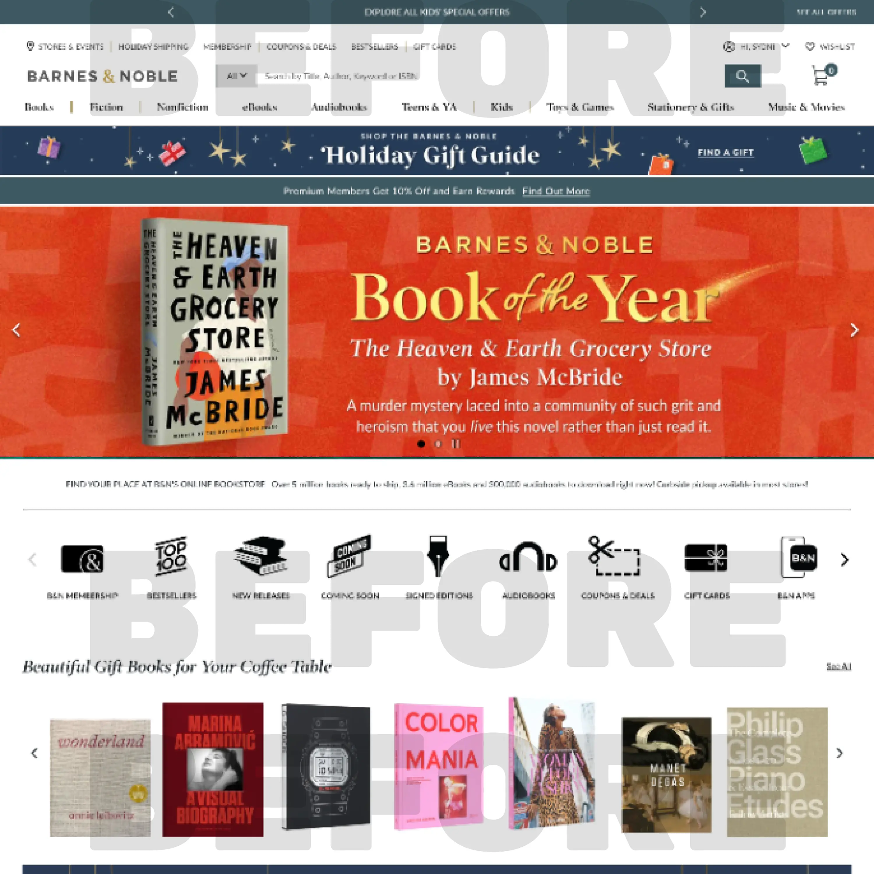
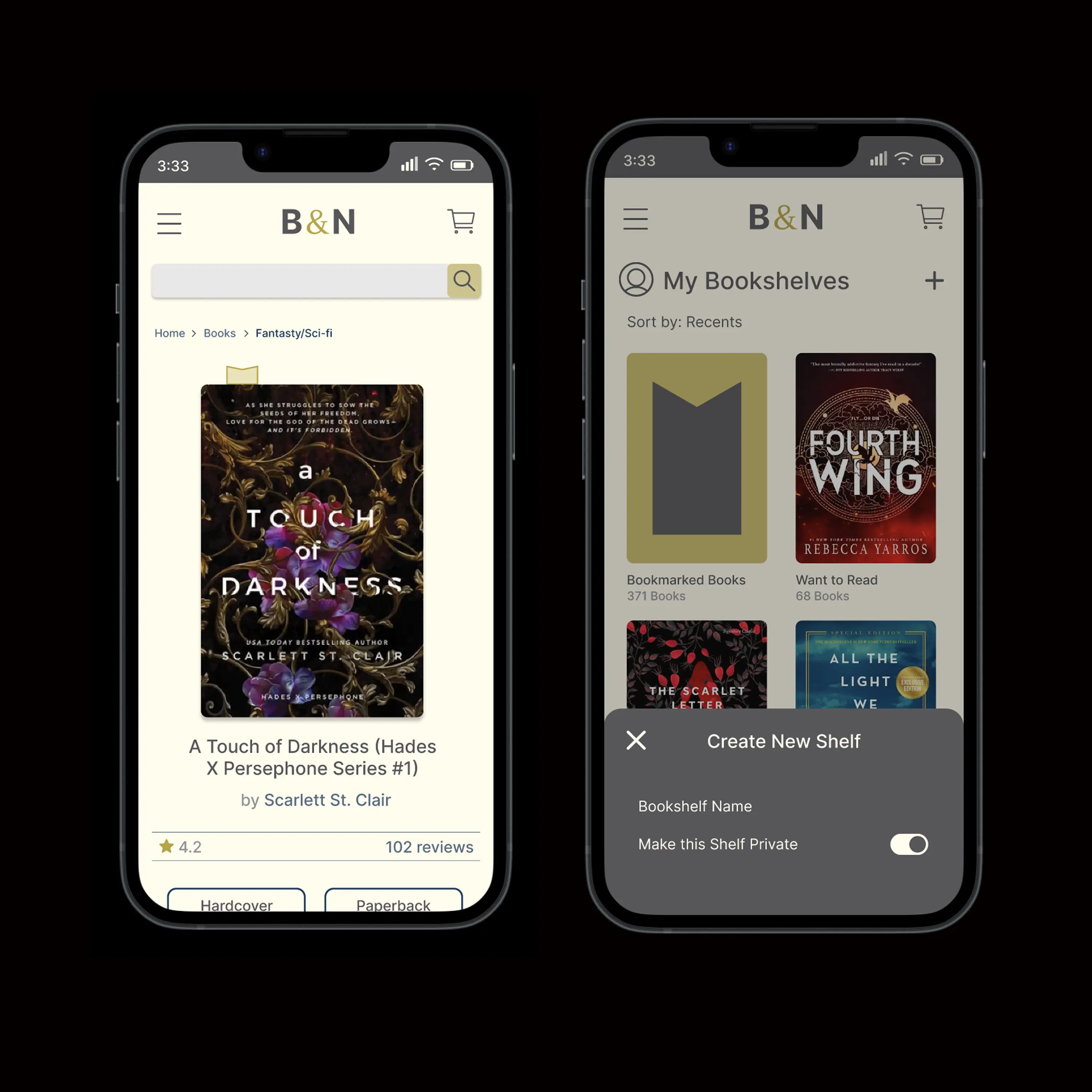
For this project I took a deep dive into analyzing Barnes & Noble's existing site, understanding it's strengths and uncovering the weak points of the user journey.
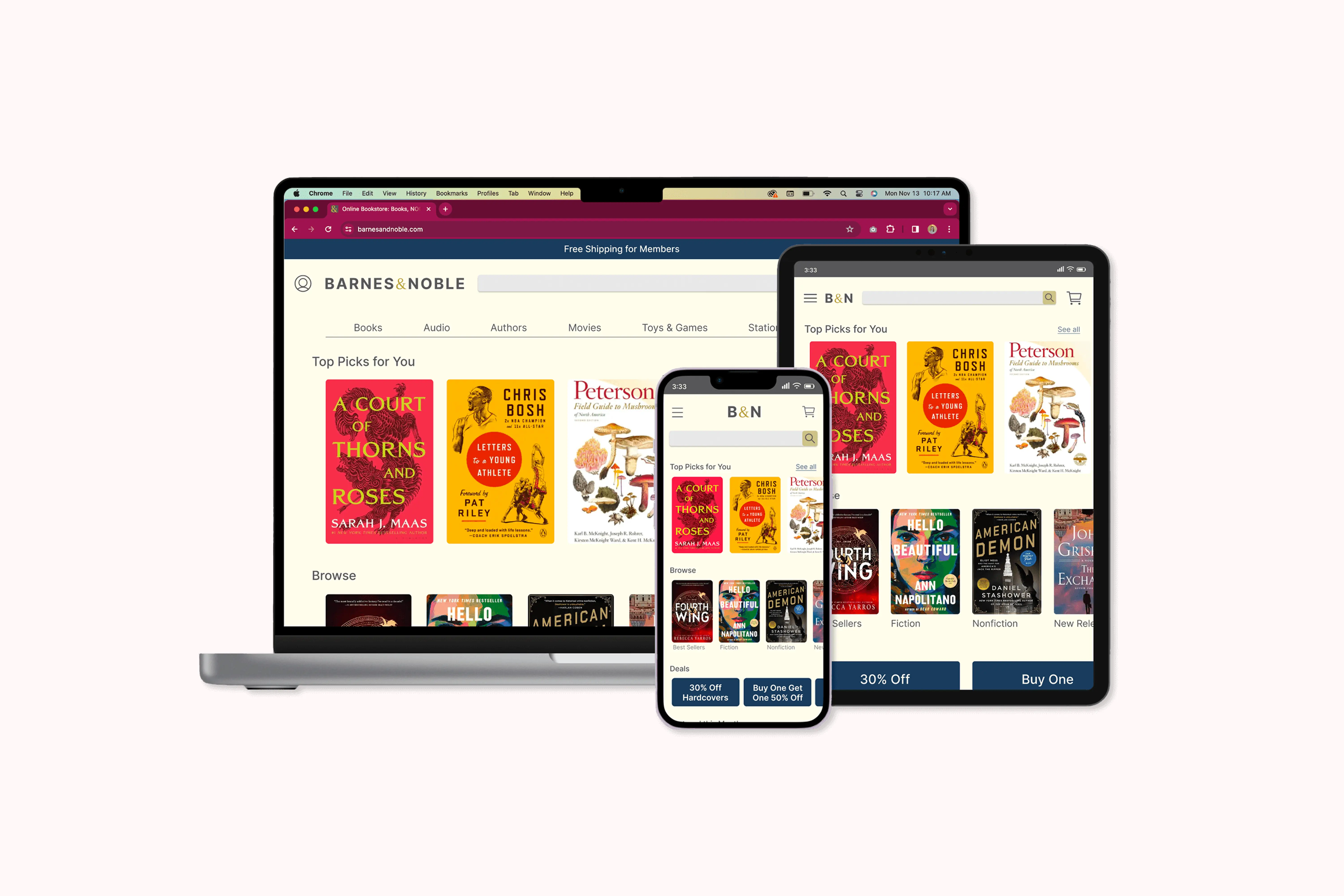
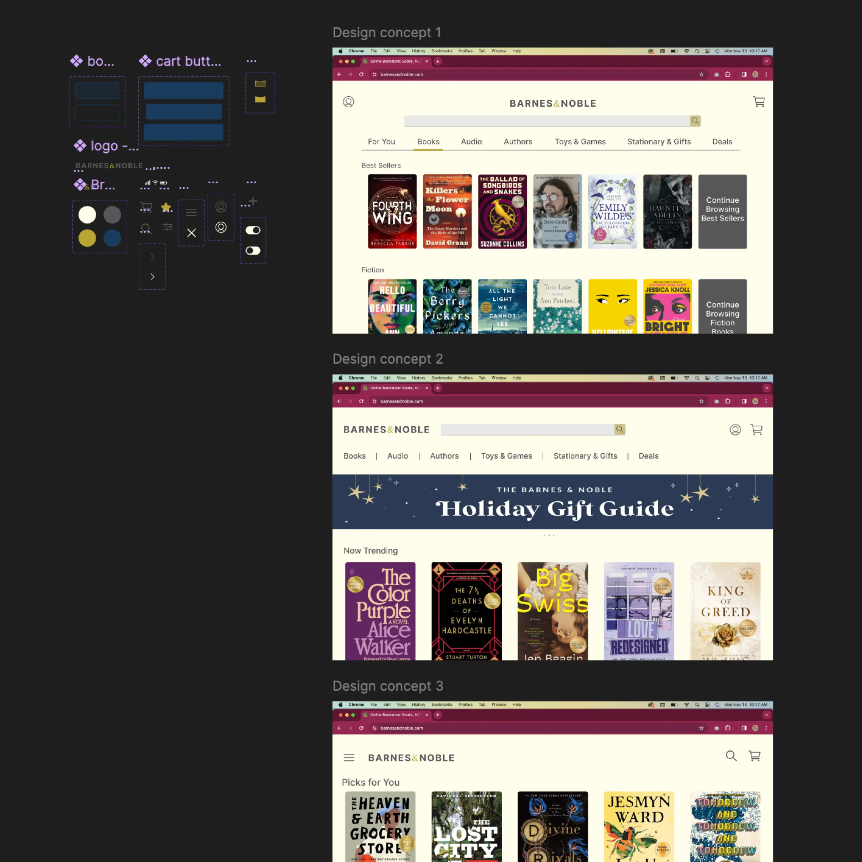
The twist with this project was to create an unexpected audience to map out user personas. From there, I created user flows, an above-the-fold analysis considering mobile responsiveness and began pulling together design concepts based on my research.
Once the homepage began to take shape, I created a Style Guide in order to refresh the brand styles while maintaining it's legacy feel.
Take a look at the full case study here.